10 Stunning Free Portfolio Layout Ideas You’ll Wish You Knew Sooner

If you’re a freelancer, designer, student, or creator looking to showcase your work without writing a single line of code, you’re in the right place. I’ve built, critiqued, and redesigned a bunch of portfolios over the years, and one thing keeps coming up: the layout matters more than you think.
A Good layout turns scattered projects into a story. Bad layout buries your best work. In this post I’ll walk you through 10 free portfolio layout ideas that are easy to build, look professional, and get results, all without coding. I’ll also sprinkle in practical tips, common mistakes, and quick ways to make each layout shine using Whoozit’s personal page builder and free templates.
Why portfolio layout is the low-effort, high-impact win
Layout is the first filter visitors use to decide whether they want to stick around. Your work might be amazing, but if the page is cluttered, slow, or confusing, people won’t get to the good stuff.
Here’s what a smart layout does:
- Makes your strongest projects impossible to miss
- Frames your skills with context, who you are, and how you solve problems
- Reduces decision fatigue by guiding visitors with hierarchy and pacing
- Keeps mobile users, who are often the majority, from bouncing
In my experience, a clear structure plus intentional visuals beats a flashy but messy site every time. That’s why the layouts below focus on clarity first, personality second, and technical gimmicks last.
Before you pick a layout: a quick checklist
Before we dive into layouts, make sure you’ve got these basics covered. Skipping them is one of the most common mistakes I see.
- Choose 6–12 of your best projects. Less is more.
- Write one-sentence project descriptions that state the problem and your role.
- Prepare 2–4 hero images per project (thumbnail, cover, in-context shot).
- Decide on a clear CTA: Hire you, view case study, or download resume.
- Gather social links, contact email, and a short bio (50–120 words).
Once those are ready, the right layout turns raw content into a compelling narrative. Below are 10 portfolio page examples, each with who it’s for, how to set it up, pitfalls to avoid, and quick customization tips.
1. The One-Page Scroll: “Everything at a glance”
This is the classic one-page portfolio: intro, featured work, process, testimonials, and contact, all stacked vertically. It’s perfect for creators who want a fast pass to everything without extra clicks.
Why it works: Visitors don’t have to click around. It’s especially effective as a link in bio for designers on Instagram or Twitter.
How to build it:
- Start with a concise hero: photo, tagline, and CTA.
- Show 6–9 projects as cards with short captions and hover states.
- Include a slim “about” section and contact block at the bottom.
Common pitfall: Cramming too many projects or long case studies into the page. Keep the one-page lean, link to full case studies only when needed.
Pro tip: Use anchor links for quick navigation and test on mobile. I’ve noticed people skim, so make the first fold count.
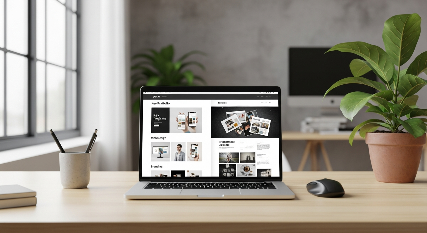
2. Grid Gallery: “Visual-first portfolio layout”
Think Pinterest meets portfolio. The grid gallery puts visuals front and center. It’s ideal for photographers, illustrators, and visual designers who want a strong visual impact.
Why it works: Your work gets maximum screen real estate and viewers can scan fast.
How to build it:
- Use a masonry or evenly spaced grid with consistent thumbnails.
- Keep captions minimal: a title, year, and one-line context.
- Allow image expansion or lightbox views for details.
Common pitfall: Poor image optimization. Big images slow load times and tank mobile performance.
Quick win: Export web-optimized images (70–80% quality) and lazy-load them. I use this trick on client sites to cut load time in half.
3. Case Study First: “Story-driven projects”
If you solve complex problems or work on product design, case studies let you show your process, thinking, and measurable impact. Put your best case study on the homepage.
Why it works: Hiring managers and product teams want to see how you think, not just the final deliverable.
How to build it:
- Tease case studies on the homepage with key metrics (before/after results).
- Click-through to full pages with challenge, approach, role, process, and outcomes.
- Include process artifacts: wireframes, flows, prototypes, and user quotes.
Common pitfall: Overlong case studies with no summary. Keep a 3-4 sentence TL;DR at the top for skimmers.
Pro tip: Add a “Project outcome” card with numbers, conversion uplift, time saved, or client quotes. Real metrics sell.
4. Split-Screen Portfolio: “Bold and modern”
Split-screen layouts divide the viewport, often image on one side, text on the other. It’s a stylish way to present dualities like “work vs. process” or “visual vs. written.”
Why it works: It creates a strong visual rhythm and is memorable when done cleanly.
How to build it:
- Keep one side image-heavy and the other side textual or CTA-focused.
- Use subtle animations to swap sides for different projects.
- Test vertical stacking on small screens so content remains accessible.
Common pitfall: Forgetting mobile breakpoints. Split screens can become awkward on phones without a clear stacked layout.
Quick tweak: Flip the stack order so the text appears first on mobile, that way users immediately see context.
5. Minimal Resume-First Layout: “Hire-me, fast”
This layout is for freelancers or job-seekers who want to get to the point. It starts with a short bio, highlights, skills, and then a curated list of projects. No fluff. No distractions.
Why it works: Recruiters and clients appreciate clarity. They want to know what you do and whether you fit the brief.
How to build it:
- Use a short headline summarizing your role and specialties.
- Include a concise skills bar or chips (e.g., Figma, React, branding).
- Feature 4–6 representative projects that align with the roles you want.
Common pitfall: Listing every tech you’ve ever touched. Stick to the tools you actually use day-to-day.
Pro tip: Add a downloadable PDF resume link and a “Hire me” CTA. I’ve seen conversion rates jump when people make contact extremely easy.
6. The Z-Pattern Portfolio: “Guides the eye”
Our eyes naturally move in a Z pattern when scanning a page. This layout uses that instinct to lead visitors from hero to work to CTA. It works nicely for studios and creative teams too.
Why it works: It creates a natural reading path that highlights your most important elements.
How to build it:
- Place your hero and prime CTA at the top-left or center.
- Move the eye across a bold visual, then down through featured projects.
- Finish with a final CTA in the lower-right corner.
Common pitfall: Overdecorating the pattern with too many animations. Keep it subtle.
Insider note: Use negative space intentionally. The Z becomes clearer when elements aren't fighting for attention.
7. Personal Story Layout: “People hire people”
A story sells. If you’re a creative who relies on emotional connection, like a brand strategist, writer, or filmmaker, put your story up front. This layout blends narrative with visuals.
Why it works: It builds trust and context, especially for clients who value personality and cultural fit.
How to build it:
- Open with a short anecdote or origin story (30–60 seconds read).
- Follow with projects that support the story, e.g., projects that reflect your values or niche.
- End with a clear call to action that ties back to your narrative.
Common pitfall: Making the story all about yourself without linking it to client outcomes. Always tie personal narrative to what you deliver.
A quick aside: Don’t be afraid to show small human details, a studio photo, a favorite tool, or a sketchbook shot. It helps.
8. Tiled Mini-Case Studies: “Depth in small bites”
This layout offers compact case study tiles. Each tile contains a short summary and key takeaway, with a link to a full write-up. It’s great for people with lots of projects who still want to show process.
Why it works: Viewers get context without committing to long reads. The pattern encourages exploration.
How to build it:
- Design tiles with a thumbnail, 2-line summary, and 1 metric or outcome.
- Use consistent visual hierarchy so tiles are scannable.
- Offer filters or tags (UI, branding, editorial) to help users narrow results.
Common pitfall: Non-descriptive summaries that sound like marketing fluff. Be specific, say what you did and why it mattered.
Pro tip: Use category tags and a search bar if you have 20+ projects. People appreciate quick filtering.
9. Interactive Prototype Showcase: “Show the UX”
If your work is interactive (apps, prototypes, microinteractions), static screenshots don’t cut it. This layout embeds prototypes, playback, or short videos so visitors can experience the product.
Why it works: It demonstrates behavior, not just appearance, essential for UX and motion designers.
How to build it:
- Embed prototype players (Figma, InVision) or short MP4 clips that loop.
- Pair each demo with a 1-line explanation of the interaction’s purpose.
- Show a quick flow diagram or storyboard for context.
Common pitfall: Auto-playing audio or long videos. Keep demos short and silent unless audio is essential.
Insider tip: Add a “Try it” link to a live prototype for hiring teams who want to poke around.
10. The Resume + Micro-Site Hybrid: “Two birds, one stone”
This hybrid works when you want both a personal website and a professional resume. It’s essentially a small site with a resume page, a portfolio page, and a contact page. Clean, familiar, and hireable.
Why it works: It covers multiple audiences, recruiters, clients, and collaborators, without confusing anyone.
How to build it:
- Keep the homepage concise with your headline, a selected project, and CTAs.
- Use a dedicated resume page (downloadable PDF and HTML-friendly layout).
- Offer a portfolio page that folders projects by discipline or role.
Common pitfall: Overlapping content across pages. Each page should have a clear purpose and different content.
Pro tip: Use canonical links and keep your resume succinct, two pages max unless you’re applying for senior or academic roles.
Design details that make layouts sing
Now for the small design choices that yield big results. These are things I test first when helping people polish their portfolios.
- Typography hierarchy, use a clear scale: hero, subhead, body, and captions.
- Spacing: consistent gutters and generous line-height improve scanability.
- Color: pick 1–2 accent colors and reserve them for CTAs and highlights.
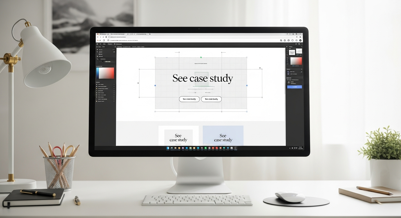
- Microcopy: short, friendly labels (e.g., “See case study” vs. “Learn more”).
- Performance: lazy-load images and compress assets for mobile speed.
These elements are the difference between “nice” and “hireable.” I usually audit these first and fix the typography and spacing, it buys credibility fast.
SEO and content tips for creative portfolios
If you want organic traffic from designer communities and potential clients, pay a bit of attention to SEO. Don’t worry, you don’t need to be an expert to get solid results.
- Use descriptive titles for projects (e.g., “E-commerce UI Redesign for Brand X, 30% conversion lift”).
- Add a short project summary with keywords like personal website layout, online portfolio ideas, and creative portfolio.
- Use semantic headings (H1, H2) and include alt text for images.
- Write one blog post per significant case study, people search for portfolio page examples and design processes.
- Share your pages in design communities with thoughtful context, not just a link.
In my experience, one well-optimized case study attracts steady traffic over time. It’s slow, but scalable.
Common portfolio mistakes (and how to fix them)
People waste a lot of time on little things that hurt more than they help. Here are the usual suspects and easy fixes.
- Too many projects: curate ruthlessly. Pick projects that reflect the work you want next.
- Missing context: always explain your role, not just the final output.
- No clear CTA: tell visitors what you want them to do: contact, hire, or view case studies.
- Slow load times: compress images and test on mobile networks.
- Unreadable text: fix contrast and font sizes so text is legible on small screens.
A simple audit takes 20–30 minutes and fixes the majority of these issues. I recommend doing one audit per quarter as your work evolves.
How to pick the right layout for you
Choosing a layout shouldn’t be emotional. Use this quick decision map I use with students and freelancers:
- If you want to be hired fast: Minimal resume-first or one-page scroll.
- If your strength is visuals: Grid gallery or split-screen.
- If you need to show process: Case study first or tiled mini-case studies.
- If you need to showcase interaction: Interactive prototype showcase.
- If you want personality front-and-center: Personal story layout.
Mix and match elements. Many great portfolios combine a grid gallery with a case-study modal, or a one-page scroll with a dedicated resume link. The point is to choose a spine, a primary layout, and bend it to your needs.
Why Whoozit makes building these layouts easier
Whoozit’s personal page builder is designed for people who don’t code but want polished outcomes. I’ve used similar tools and what stands out about Whoozit is how quickly you can prototype multiple layouts and test them live.
You get drag-and-drop blocks, responsive templates, and pre-built sections for case studies, hero areas, and contact. That means you can try a one-page scroll today, clone it into a grid gallery tomorrow, and compare which one performs better.
No plugins, no code, and no messy setup. That’s perfect when you're juggling client work, classes, or multiple gigs and need to iterate quickly.
Read More:
Portfolio Website vs Behance: What’s Better for Showcasing Your Creative Work in 2025?
Why Every Freelancer Needs a Profile Creation Website in 2025
Practical checklist to launch your free portfolio today
- Pick one layout from this list that matches your goals.
- Gather 6–12 projects and concise copy for each.
- Optimize images for web and mobile.
- Use Whoozit or another portfolio builder to assemble your page.
- Test on mobile, tablet, and desktop. Check load times and legibility.
- Ask 3 peers for feedback, they’ll spot confusing bits you missed.
- Launch, share in communities (Dribbble, Behance, LinkedIn), and iterate.
Launching is the hardest part. I’ve noticed that people delay for perfection. Ship something good and improve it weekly.
Real-world examples and inspiration
Looking for portfolio page examples? Start by bookmarking sites that match your chosen layout. For instance:
- One-page scroll: designers who use strong hero teasers and condensed projects.
- Grid gallery: photographers on image-heavy homepages with lightboxes.
- Case study first: product designers who lead with process and outcomes.
- Interactive showcase: UX folks embedding live prototypes or short demo videos.
Don’t copy the aesthetic. Copy the strategy. See how each example prioritizes content, and then adapt those patterns to your voice and work.
How to measure success
Don’t obsess over vanity metrics. Focus on actions that indicate professional interest.
- Contact clicks or form submissions
- Time on page for case studies (are people reading?)
- Click-through rate from hero to full case study
- Social shares and direct messages from industry folks
Set a simple goal: get one meaningful lead in 30 days. Then iterate on the layout and copy until that happens reliably.
Final thoughts: make the layout work for you, not the other way around
Your portfolio is a tool, not a trophy. It should open doors, not exist as a static résumé of past work. Choose a layout that aligns with the kind of work you want next, keep it lean, and tell clear stories.
Try a layout, measure results, and don’t be afraid to swap it if it’s not converting. The beauty of modern portfolio builders is that you can experiment rapidly and that’s how great portfolios are made.