Why Every Freelancer Needs a Profile Creation Website in 2025
Freelancing in 2025 looks different from five years ago. The platforms keep changing, attention spans keep shrinking, and clients expect signal over noise. If you’re a designer, creator, student, or job seeker, one simple move can change how people find and hire you: owning a clean, focused profile creation website.
I’ve noticed freelancers who invest just a few hours into a solid personal site close better projects and cut negotiation time. It’s not about flashy animations or a complicated CMS. It’s about clarity, a professional bio page that acts as your home base, your link in bio, and your portfolio in one tidy place.
What exactly is a profile creation website?
Think of it as a one-page website or a small multi-page site designed to showcase who you are, what you do, and how to contact you. It’s not a full company website. It’s a personal site creator for your professional identity, your digital business card, portfolio website, and profile link page rolled into one.
Profile creation tools, like online portfolio builders and personal page creators, let you assemble work samples, quick bios, client testimonials, pricing teasers, and social links without wrestling with hosting or code. Many are optimized for fast load times and mobile-first viewing so hiring managers can tap through on their phones.
Why freelancers should care in 2025
Because platforms change and algorithms don’t care about your weekend projects. You need a stable place people can always find. Here’s what a profile website gives you:
- Ownership and control: Social platforms can shadow-ban, ban, or change how they surface content overnight. Your personal site is yours. You control design, messaging, and the links clients click.
- Higher trust and credibility: A clean personal branding website looks more professional than an Instagram grid or an unstructured Google Drive link. It says you take your work seriously.
- Better discovery: An optimized profile site helps you show up in searches, think “freelancer portfolio site” or “portfolio website for students.”
- One-link convenience: You can replace multiple links with a single profile link page. That makes your social link in bio tools actually useful.
- Conversion-focused design: Good profile sites are built to turn visitors into leads, clear CTAs, visible contact, and targeted case studies.
In short: it’s your central hub. When I meet freelancers who juggle three different platforms and a messy PDF, I always tell them, consolidate. Clients prefer a single, easy-to-digest place to see your work.

Profile creation vs. classic portfolio: What’s the difference?
The words “digital portfolio” and “portfolio website” get tossed around a lot. A portfolio website often highlights long-form case studies and multiple project pages. A profile creation website focuses on speed and clarity: quick snippets of your best work, a professional bio, pricing or services, and direct contact options.
In practice, they overlap. But I recommend starting with a one-page website if you’re building your online identity. You can always expand later into a full portfolio with deeper case studies and a blog.
Top benefits that actually matter
Let’s unpack the tangible wins you’ll see after launching a solid profile creation website.
1. Faster client decisions
Clients often skim. If they can see your best work, a clear headline (“I design mobile apps for early-stage startups”), and a visible CTA (“Book a 15-min intro”), they’ll decide quickly. Longer waits usually mean lost opportunities.
2. Better search visibility
With basic SEO optimized titles, a well-written meta description, and a few targeted keywords, you’ll start showing up for “personal branding website” or “best profile website” searches. That organic traffic compounds over time.
3. Easier pricing conversations
When people see what you charge (or a pricing range) and examples linked to that price point, they qualify themselves. You’ll spend less time explaining scope and more time doing the work.
4. Flexible link in bio
Use your profile as the single link on social platforms. Instead of scrolling through Instagram DMs for attachments, clients open your professional bio page with everything neatly organized. A simple win, but it saves hours.
5. Stronger personal brand
Consistent language, colors, and messaging across a profile site make you memorable. In my experience, small branding choices, a consistent strapline, a headshot with the same background across platforms, increase recall by potential clients.
Who benefits most?
The short answer: almost everyone who needs to be found for paid or creative opportunities. But here’s a breakdown:
- Freelancers: Designers, developers, writers, consultants, anyone who wants to show work and get hired.
- Creators & influencers: Musicians, podcasters, and video creators can use a profile link page to centralize platforms and sponsors.
- Students & early-career pros: A portfolio website for students makes projects and class wins scannable by recruiters.
- Job seekers: A professional bio page supports your resume and LinkedIn profile and can be shared in applications.
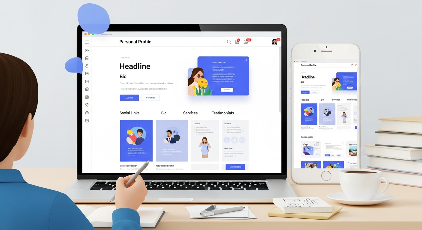
What to include on your profile creation website
Not sure what belongs on your personal site? Keep it simple and strategic. Here’s a checklist I use when coaching freelancers:
- Clear headline: Tell visitors who you help and how (one sentence).
- Short bio: A 2–3 line summary with a personal touch, say something memorable.
- Top 3 projects: Use case snapshots, images, and a one-liner about impact.
- Services & pricing: Be transparent or use ranges to qualify leads.
- Social links: Your active profiles and a “hire me” link.
- CTA: Book a call, email, or a contact form, make it visible.
- Testimonials or logos: Social proof from clients or collaborators.
- Downloadable resume or media kit: Optional, but handy for recruiters.
Keep in mind: people rarely scroll past the fold on mobile. Lead with your best stuff and a clear CTA.
Design and content tips that actually work
Design trends come and go. Good design principles endure. Here are practical tips that get results:
- Prioritize speed: Use compressed images and avoid heavy embeds. Slow sites kill conversion.
- Use readable type: Stick to two font sizes for headings and body. Clean typography helps people skim.
- Keep visuals purposeful: Screenshots, short GIFs, and 1–2 hero images are enough. Avoid long auto-play videos unless necessary.
- Write like you talk: Replace jargon with simple phrases. “I help founders improve onboarding” beats “Synergize user engagement.”
- Use sections: Headline, projects, services, social proof, contact. That order works for most freelancers.
- Mobile-first design: Test on your phone and adjust spacing and CTA size for thumbs.
One small trick I use: write your bio aloud. If a sentence sounds stilted when you say it, rewrite it. That simple check makes the tone feel natural and human.
SEO for profile websites
SEO doesn’t have to be scary. For a profile site, you want targeted, low-effort wins that bring qualified traffic. Here’s the approach I recommend:
- Choose 2–3 focus keywords like “profile creation tools,” “freelancer portfolio site,” or “personal page creator.”
- Include your primary keyword in the title tag, the H1, and one subheading.
- Write a concise meta description that invites clicks, mention services or location if relevant.
- Use descriptive filenames and alt text for images (e.g., “ux-case-study-onboarding.jpg”).
- Link to your site from your social profiles and any guest posts or directories.
These actions don’t guarantee overnight rankings, but they lay the groundwork for steady organic traffic. I’ve seen newly launched profile sites start appearing in niche searches within weeks when combined with regular social shares.
Common mistakes freelancers make (and how to avoid them)
People often overcomplicate or under-prepare their profile sites. Here are the frequent missteps I see:
- Too much content: Throwing every project and tiny detail onto the page. Solution: curate. Showcase top 3–5 projects that represent the type of work you want.
- No clear CTA: Visitors don’t know what to do next. Solution: add a bold “Contact” or “Book a call” button in the header.
- Hidden contact info: Email or booking links buried in the footer. Solution: keep contact visible and frictionless.
- Mismatched messaging: Your portfolio shows high-end product design but your copy promises quick gig work. Solution: align your positioning and pricing.
- Poor mobile experience: Desktop-only layouts that break on phones. Solution: test and adjust padding, font size, and button placement.
A practical rule: if you can’t explain your service in one clear sentence, you haven’t clarified your offer enough.
How a profile site helps students and early-career creatives
Students often wrestle with the question: “I don’t have enough work to show.” That’s okay. A portfolio website for students should emphasize process, learning, and potential.
Include class projects, a short case study that shows your thinking, links to GitHub or Dribbble, and a resume download. Highlight problems you solved and the tools you used, potential employers care about process as much as polish.
I’ve seen junior designers land internships after a recruiter skimmed a one-page site and liked the clarity of their process. That beats a long PDF any day.
Read More:
The Secret to a Standout Personal Web Page Every Creator Should Know
How Portfolio Consumers Influence Your Brand’s Growth
Link in bio tools vs. profile sites
Link in bio tools are convenient. They’re great for Instagram, TikTok, and Twitter. But many are limited in customization and ownership. A profile creation website gives you both: the consolidation that link in bio tools provide and the SEO, design, and credibility of a proper site.
Here’s a workflow I recommend:
- Create a one-page personal site as your primary hub.
- Use your profile link page (on platforms like Whoozit) as the link in bio for social accounts.
- Keep the link in bio updated with campaign-specific links (latest release, a blog post, a hiring page).
This approach maximizes reach without fragmenting your audience.
How to build your profile website quickly
Don’t let perfectionism stall you. If you want to launch in a day or two, follow this sprint plan:
- Choose a personal site creator or online portfolio builder (pick one with templates).
- Write your headline and 50–100 word bio first.
- Pick three projects and prepare images + 1–2 sentence impact statements.
- Add a contact method, email, booking widget, or form.
- Publish and share the link on LinkedIn, Twitter, and your email signature.
A quick launch beats waiting for perfect copy or the perfect design system. You’ll learn more from live visitors than endless iterations in a draft folder.
Why Whoozit is worth trying (and it’s free)
If you want something fast, low-friction, and purpose-built for freelancers, check out Whoozit. It’s a free profile maker and personal page creator that focuses on one-page websites and profile link pages.
In my experience, Whoozit nails the essentials: quick setup, templates optimized for visibility, simple SEO fields, and a clean aesthetic that feels modern without being trendy. It’s especially useful if you want a link in bio tool that actually behaves like a small portfolio.
Whoozit offers:
- Pre-built templates for freelancers, creators, and students
- Easy customization without code
- Support for images, video embeds, and downloadable resumes
- Link in bio-friendly pages that integrate with social platforms
- A free plan so you can test it without commitments
One nice detail I appreciate: Whoozit keeps page load fast by optimizing assets automatically. That’s a small but significant advantage for mobile visitors who often decide in seconds whether to stay or bounce.
Real-world examples and quick case studies
Let me give you a few short, realistic scenarios you can relate to:
Case A: Mira - UX designer
Mira used Whoozit to build a clean profile link page that led with a downloadable case study. She linked it in her IG bio, and within a month a startup PM reached out and converted to a paid project. The PM said they appreciated seeing process rather than just screenshots.
Case B: Daniel - recent grad
Daniel created a portfolio website for students highlighting three school projects and his skills. He included GitHub links and a one-line result metric for each project. He landed two interviews directly from recruiter searches because his site appeared for “portfolio website for students” queries.
Case C: Lila - freelance writer
Lila used a one-page website as her personal branding website and included a pricing range. That transparency cut back on time-wasting pitches and increased her close rate. She also used Whoozit’s templates to set up a media kit quickly.
These are short examples, but they show the same pattern: clarity + accessibility = more opportunities.
Onboarding and maintenance
After launch, a few small rituals keep your site working for you:
- Monthly update: add one new project or tweak your headline.
- Quarterly audit: check links, refresh images, and test contact forms.
- Share: post the site link when you finish a big project or publish a case study.
I recommend scheduling 30 minutes monthly to keep your profile fresh. That little bit of upkeep prevents your portfolio from feeling dated after a year of growth.
Integrations and growth: next steps after launch
When you’re ready to grow, consider these options:
- Add a blog or notes section to share process and show your voice, this helps SEO.
- Embed a scheduler (Calendly or similar) to reduce back-and-forth emails.
- Collect emails for a small newsletter, invite past clients to subscribe.
- Track visits with simple analytics to see what projects attract attention.
These steps are optional, but they help you scale from a personal bio page to an active lead machine without much technical debt.
Price and value: how much to invest
My advice: start with a free profile maker or a low-cost template. You don’t need an expensive agency site to attract great clients. Spend your budget on a clear, professional headshot and a few well-photographed project images.
When revenue starts flowing and you want custom branding, invest in a paid plan that includes a custom domain and analytics. That’s usually enough to move from starter to professional without major rebuilds.
Common pitfalls when promoting your site
Launching isn’t the end. Promotion matters. Here are mistakes to avoid:
- Relying only on passive traffic: Don’t expect instant organic growth. Share the link in outreach, on LinkedIn posts, and in proposals.
- Over-tagging on social: Too many hashtags or irrelevant tags dilute impact. Target your niche instead.
- Forgetting to measure: No analytics means no idea what’s working. Add simple tracking and review monthly.
Promotion is steady, small actions. A weekly LinkedIn post and occasional sharing in relevant groups will outperform sporadic, frantic posting.
Checklist before you hit publish
Use this quick checklist to avoid obvious problems:
- Headline communicates value in one line
- 3–5 curated projects with short impact statements
- Visible contact method and clear CTA
- Mobile-friendly layout
- SEO basics: title, meta description, and image alt tags
- Proofread copy and test external links
- Set up analytics and a simple contact automation
Final thoughts: start small, stay consistent
Building a profile creation website doesn’t have to be a massive project. Launching a one-page website or using a free profile tool gives you a reliable home base. Over time you can expand that into a long-form portfolio, a blog, or a branded personal site.
In my experience, the single biggest change freelancers can make is to stop hiding behind platform noise and take ownership of their online identity. A straightforward personal site increases visibility, reduces friction, and helps you close more work.
If you’re ready to try it, pick a simple template, write a clear headline, and publish. You’ll learn faster by doing than by endlessly planning.