Secrets of Freelance Website Creation That Win Clients

This blog is a practical guide to turning freelancer websites into client-acquisition tools. It argues that many freelancer sites underperform because they act like resumes, are cluttered, or lack clear offers. The author presents 20+ actionable "secrets": lead with one clear offer, design the homepage as a landing page, prioritize concise outcome-focused copy, feature one strong case study, make portfolios scannable, show simple pricing, optimize for a single conversion, reduce clicks, add micro-proofs, and prioritize mobile speed. The post includes quick wins, templates, a launch checklist, measurement advice, and recommends no-code tools like Whoozit to speed building and testing.
You probably already know that a website matters. But not all websites pull their weight. Some look great, but fail to bring in clients. Others generate leads but feel clunky and unprofessional. My experience of building and reviewing freelancer websites numbered a few dozen, and through the process, I stumbled upon a few unexpected things that cause a site to either be deserted or really generate work.
If you are creating websites for clients, selling your services online, or handling a personal brand, this is your guide. I will unfold practical freelance website design tips together with a few conversion, focused tricks that do not require heavy coding. Expect simple examples you can copy, common mistakes to avoid, and realistic ways to turn your site into a client acquisition website.
Where it is helpful, I will refer to no, code alternatives and illustrate how to build a freelancer portfolio website or a personal website for freelancers that converts. If you are in a hurry, I will point out ways in which Whoozit can help you make the process smoother.
Why is your website still underperforms
Most freelancers approach their website like an online resume. That’s fine, but it misses two big things. First, people who land on your site want one of three outcomes. They want to hire you, learn if you’re credible, or share your info. Second, they decide within seconds whether to stay. Your design, headlines, and first few paragraphs must answer those needs quickly.
I’ve noticed freelancers often overcomplicate their homepages. They try to throw everything on the page at once. Portfolio, pricing, blog, contacts, testimonials. The outcome is a cluttered page that gets the visitors confused. A simpler approach works better. Instead of completeness, prioritize clarity.

Secret 1: Lead with one clear offer
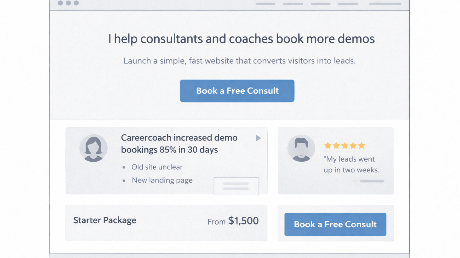
Lead with one clear offerHeres a quick check. Go to your site and ask yourself, What action do I want this visitor to take? If you can't give an answer in a single sentence, then your page is not in line with your goals. Choose a main goal. It could be a discovery call, checking your portfolio, or getting a case study on one page.
Make that goal stand out. Along with a main headline that is short, provide a subheadline that describes the benefit, and a single clear CTA. For instance:
Headline: I build conversion-focused websites for coaches and consultants. Subheadline: Launch a simple site that turns visitors into paying clients in under two weeks. CTA: Book a free consult.
One focused offer reduces friction. It turns casual browsers into qualified leads. If you need to include other options, present them as secondary links only.
Secret 2: Design a landing page for your home page
Don't continue to use your home page as a dump for everything you do. Instead, make it resemble a targeted landing page leading to your CTA. This means that a clear problem statement, immediate proof that you can solve it, and an easy next step should follow.
The structure works like this:
- Hero: short headline, one sentence about who you help, primary CTA
- Problem: one paragraph that nails the pain your ideal client feels
- Solution: a short list of what you provide and how it helps
- Proof: a small case study, testimonial, or result
- Pricing or process: a quick idea of cost or timeline
- Final CTA
Use this template for client acquisition websites and freelance business websites. It keeps the reader moving in one direction instead of leaving them to wander.
Secret 3: Copy beats visuals early on
Yes, clean visuals matter. But if your headline is vague, your design won’t save you. Clear copy communicates value fast. That first sentence should tell people who you help and what outcome they get. Keep it specific.
Bad headline: I build beautiful websites. Good headline: I help solo consultants triple their demo bookings through fast, conversion, focused websites.
How different it is! The second headline addresses a person and a result. Such copy will entice more engagement and clicks. If you are unsure, write as if you are answering the question your client is going to ask.
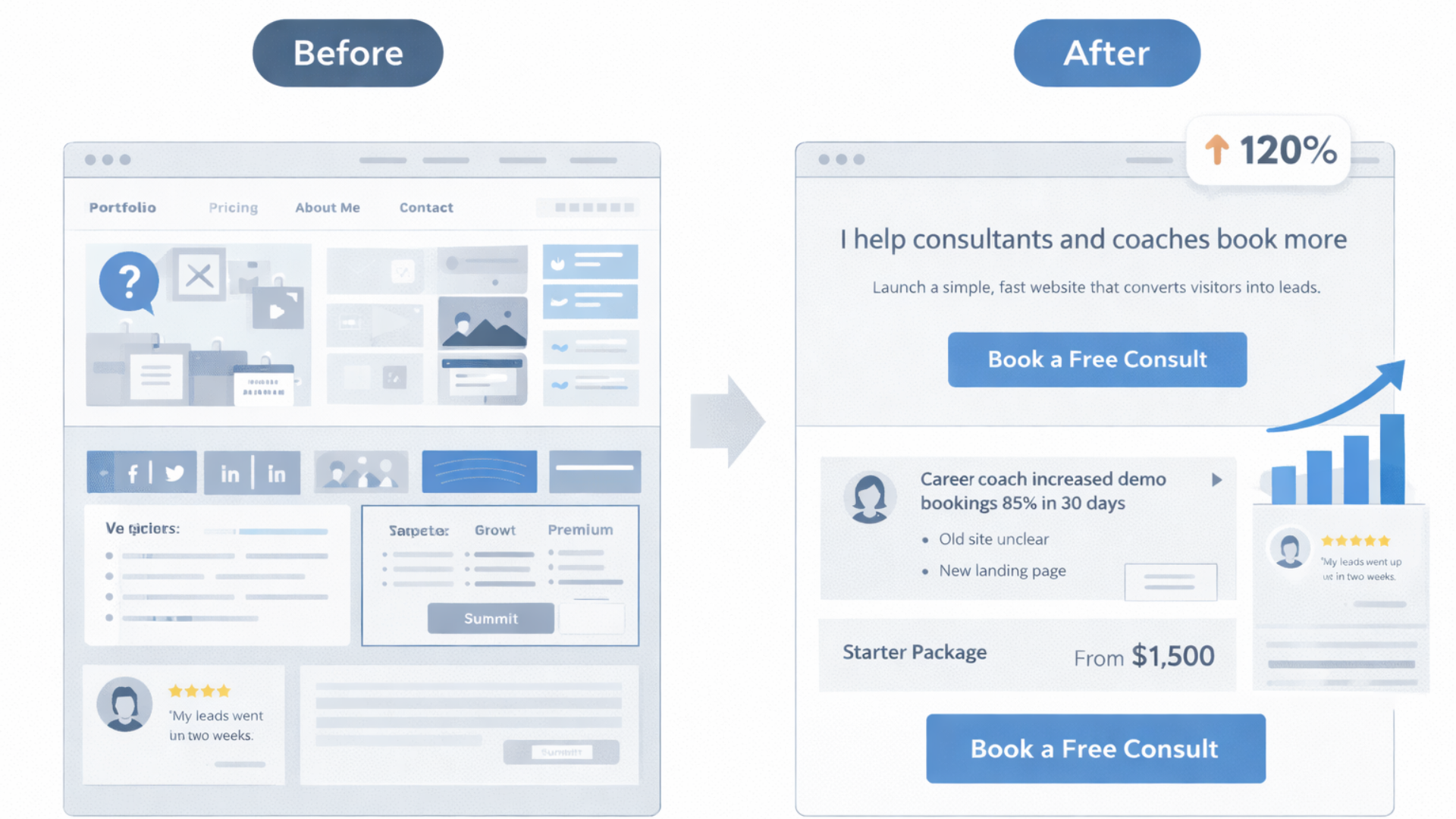
Secret 4: Display one powerful case study rather than ten weak ones
People want proof, but a long line, up of small works might lessen the influence. Choose one or two convincing case studies that show the kind of work you want to do. Share a short story. Show the problem, the approach, and the result in metrics where possible.
Example layout for a case study:
- Client type: independent designer
- Problem: low demo bookings and unclear pricing
- Solution: simplified homepage, pricing table, and one, click booking
- Result: demo bookings increased 120 percent in 6 weeks
Short, numbers, driven stories are not just a way to show skills, but also show outcomes. Clients hire based on outcomes.
Secret 5: Make your portfolio scannable
Most people skim. They scan titles, pictures, and figures. Adjust the layout of your portfolio accordingly. Use headings in bold, very short descriptions, and a visually clear presentation. If possible, include a short sentence about the results or metrics achieved.
Example entry:
- Project: E-commerce landing page
- Result: 35 percent increase in conversion rate after redesign
- Tools: Webflow, Stripe, Google Analytics
That gives readers immediate context. They know the project, the result, and what you used to get it done.
Secret 6: Use simple pricing cues
Pricing is awkward but unavoidable. You don't need a full quote calculator on your site. You do need a starting price or a pricing range. People prefer a transparent baseline. It helps self-qualify leads and saves time for you and the client.
Try one of these simple approaches:
- Starting price: Sites from $1,500
- Tiered packages: Starter, Growth, Premium with 3 bullets each
- Range: Typical projects range from $2k to $6k
Couple the price info with a short note on what’s included and expected timelines. That reduces surprise and avoids long back-and-forths.
Secret 7: Optimize for one conversion at a time
Conversion optimization is often treated like a spreadsheet exercise. Don’t overcomplicate it. Pick one conversion you care about most and optimize for that. For freelancers, that conversion is usually booking a discovery call or requesting a quote.
Make the CTA consistent across pages. Keep the path short. Use microcopy to reduce hesitation. For example, instead of a generic button that says Get in touch, try Book a 15 minute call. That tells visitors what to expect and lowers friction.
Secret 8: Remove optional clicks and steps
Every extra click loses visitors. Think of your site as an obstacle course. The fewer obstacles, the better your completion rate. If your primary goal is discovery calls, make booking one possible from the header, the footer, and right after case studies.
Use a simple booking widget or link that opens a calendar. If you use Whoozit or another no-code website builder for freelancers, integrate the calendar so visitors can pick a time without leaving your site.
Secret 9: Use micro-proofs and social signals
Not every visitor will read your case studies. Sprinkle small proofs across the site. Quick wins include client logos, short testimonials, published articles, and trust badges. Keep them real and specific. One line quotes that include a name and result perform best.
Example micro-proof: "Doubling demo signups in 4 weeks. Priya, Founder." That tells a compact story and builds trust fast.
Secret 10: Speed and mobile matter more than you think
Mobile traffic is often the majority. A slow mobile experience kills conversions. Compress images, use lazy loading for offscreen images, and avoid heavy scripts. If you're using a no-code website builder for freelancers, pick one that prioritizes performance.
Test your site on a phone. Navigate, click the CTA, and check how quickly the booking form opens. If it feels sluggish, people will leave before they form an opinion.
Secret 11: Build for search, but don't overdo SEO
SEO helps with long-term discovery. For freelancers, local search and niche keywords usually matter most. Include clear phrases like freelance website design tips, freelancer portfolio website, and personal website for freelancers in your headings and meta descriptions where natural.
Avoid keyword stuffing. Write for humans first. Use a few focused keywords across your main pages and build a small blog with niche posts that answer specific questions your clients ask. That attracts qualified traffic without waste.
Secret 12: Use templates and components wisely
Templates save time, but cookie cutter sites lose personality. I like using a base template and customizing key spots: the hero, an about section with a real photo, and a case study that shows your way of thinking. Those pivots make the site feel tailored without reinventing the wheel.
If you use a no-code website builder for freelancers, build a component library. Headings, CTA sections, testimonial cards, and pricing blocks. Reuse what works, tweak copy, and keep visual consistency.
Secret 13: Make contact frictionless
Contact forms are necessary, but they can be gatekeepers. Keep forms short. Ask only for what you truly need to qualify the lead. Name, email, and one quick filter question will get you 80 percent of the useful leads. You can always request more during the call.
Offer alternative contact methods. Some people prefer email. Others want to book a call. Add both and make the booking option prominent.
Secret 14: Push the right follow-up
Getting a lead is half the job. The follow-up sequence matters. If someone books a call, send a confirmation with a short prep list. That aligns expectations and boosts show rates.
If someone fills out a form but doesn't book, follow up with a short email that references their problem and offers a quick next step. In my experience, a short, friendly follow-up increases response rates significantly.
Secret 15: Track the right metrics
Not all metrics are equally useful. Vanity metrics like page views won't pay the bills. Track things that show real business impact. For most freelancers, the key metrics are:
- Bookings per month
- Lead quality and close rate
- Traffic sources that convert
- Time to first contact after lead submission
Install basic analytics and label your CTAs. That way, you can see which pages and funnels are actually driving client conversations.
Secret 16: Your about page is a sales page
People visit your about page to decide if they like working with you. Tell a short story that highlights who you help and why. Avoid long resumes. Keep it personal and outcome-focused.
Try this structure:
- One-line introduction: who you are and who you serve
- Why you do it: short personal motivation or story
- What you do and how it helps clients
- Social proof or relevant badges
- CTA
I've seen about pages increase conversion when they include a short video or a friendly headshot. People buy from people.
Secret 17: Add a focused blog that answers client questions
Blogging can feel like a grind. Don't write generic posts that try to rank for everything. Instead, publish short posts that answer very specific questions your clients ask. Each post should be actionable and end with a logical next step to book a call or view relevant work.
Topics could include freelance website design tips like how to set up booking buttons, a checklist for launching a freelancer's personal website, or how to optimize a freelancer's portfolio website for conversions. These are useful phrases that help you show up for real search queries.
Secret 18: Use quick experiments to improve conversion
Small tests beat big guesses. Try A B testing a headline, a CTA, or a hero image for a few weeks. Keep changes limited and track the results. In my experience, testing headlines often yields the fastest lift in click-through rate.
Run one experiment at a time. That keeps results clear and helps you avoid chasing noise.
Secret 19: Build for extendability
Your needs will change. Today, you might only do single page sites. Next year, you might add e-commerce or membership offers. Use a stack or a no-code platform that lets you add features without a full rebuild.
Whoozit and similar services let you move fast. They provide modular components and integrations with booking, payments, and analytics. That way, you can scale your freelancer business website without rewriting everything.
Secret 20: Packaging services make sales easier
People shop for packages. When you offer clear packages with deliverables and timelines, clients can pick and commit faster. Package names, short bullets, and a visible price range reduce friction and support higher conversions.
Simple package example:
- Starter: one-page site, contact form, 3 day turnaround
- Growth: 3 page site, booking integration, basic SEO, 7 day turnaround
- Premium: 5 page site, CMS, advanced forms, 14 day turnaround
Keep the descriptions short and outcome-oriented. That helps visitors decide quickly.
Common mistakes freelancers make
Avoid these pitfalls that I see often.
- Too many CTAs. Multiple equally strong CTAs create indecision. Pick one primary action.
- Hidden pricing. No price scares away qualified leads and invites low-ballers.
- Long forms. Only ask for what you need to qualify the lead. You can always collect more later.
- Neglecting mobile. If your site is slow or clumsy on phones, you’ll lose a lot of visitors.
- No measurable goals. If you can’t track bookings or lead sources, you can’t improve.
Quick wins you can implement today.
Here are simple, high-impact changes you can make in an afternoon.
- Update your headline to mention the specific client you help and the outcome you deliver.
- Add a single CTA that points to a short booking calendar link. Put it in the header and hero.
- Replace generic testimonials with one-line results and a name.
- Limit your contact form to three fields: name, email, and one qualifying question.
- Compress your hero image and test load times on mobile.
Do those five things, and you’ll usually see better engagement that week. In my experience, the headline and booking CTA changes provide the fastest lift.
Simple examples you can copy
Below are bite-sized copy snippets and layout ideas you can paste into your site. Keep them plain and tweak as needed.
Hero copy
Headline: I build simple websites that help solo consultants book more demos.
Subheadline: Launch a conversion-ready site in 7 days. No code required. CTA: Book a 15 minute consult
Short case study
Client: Solo career coach. Problem: Low demo signups. Solution: New homepage, price transparency, booking widget. Result: Demo bookings up 85 percent in 30 days.
Pricing snippet
Starter: One-page site from $1,200. Includes contact form and calendar integration.
Contact form microcopy
“Tell me the project in one sentence. I’ll reply within 48 hours.”
How to pick the right tools for your freelance website
Choosing tools gets easier when you tie the choice to what you need today. Ask yourself:
- Do I need speed of launch? Choose a no-code website builder for freelancers.
- Do I want to control design precisely? Choose a flexible visual builder or Webflow.
- Do I need e-commerce or recurring billing? Pick a platform with payment integrations.
For most freelancers, a polished no-code website builder gives the best balance of speed and control. That way, you can deliver client work faster and focus on strategy and communication.
When to graduate to custom work
Not every project needs custom code. Reserve custom builds for projects that need unique interactions, complex integrations, or a very specific brand identity. For standard portfolio sites and client acquisition websites, templates and smart components work great.
If a client asks for complex backend logic, a custom build may be worth the investment. Just be honest about timelines and costs. I tell clients that if the core need is speed and clear conversions, a no-code approach will usually be cheaper, faster, and just as effective.
Client-facing process that saves time
Streamline how you work with clients. Here’s a simple, repeatable process I use:
- Discovery call: 15 to 30 minutes to confirm scope and budget
- Proposal: short one page with timeline, deliverables, and price
- Design sprint: wireframe and one hero design for approval
- Build and review: two review cycles, then launch
- Handoff: brief training and documentation for the client
This process keeps projects moving and reduces endless revisions. It also makes your pricing defensible because each phase has clear deliverables.
How to talk about results without overselling
Clients want outcomes, not claims. Frame results with context. Use numbers when possible and be honest about variables that affected performance. If a result came from multiple channels, say so.
Example: "After redesigning the homepage and adding a booking link, the client saw a 60 percent increase in demo bookings over six weeks. Organic traffic and ad spend were stable during that period." That sounds credible and still impressive.
Freelancer's personal branding that actually helps conversion
Your personal brand does more than look nice. It helps clients decide if you fit their project. Keep your branding consistent across LinkedIn, your portfolio, and project pages. Use the same headshot, headline, and short bio. That consistency builds recognition and trust.
In my experience, a consistent visual identity plus a focused message leads to higher reply rates from outreach and warmer discovery calls.
Getting clients from your site: outreach and funnels
Your website should support active outreach, not replace it. Use short landing pages to support outreach campaigns. For example, if you reach out to agency leads, point them to a case study page built for similar agencies. If you're cold emailing, include a specific link that pre-frames your value.
Use automation, but keep messages personal. A short, tailored note that links to a relevant page works better than generic templates. Always include a clear next step, like Book a 15 minute call or View a demo.
Easy SEO wins for freelancers.
SEO doesn't have to be a long game. Try these smaller tactics that bring qualified visitors:
- Write blog posts that answer specific client questions, like how to create a freelancer portfolio website that converts.
- Use focused keywords in headings and meta descriptions, such as freelance website design tips and website conversion optimization for freelancers.
- Claim local listings and add location pages if you serve a region.
- Get one or two links from industry sites or partner pages.
These steps help you show up for searches that actually lead to clients.
When to measure and iterate
Schedule a regular review of metrics and client feedback. Monthly checks are often enough. Look at bookings, site speed, and which blog posts or landing pages are generating leads. Then test one change and measure for a few weeks.
Small, steady improvements beat big periodic redesigns. I recommend a monthly “what worked, what didn’t” note to yourself. It keeps your site aligned with your business goals.
Real-world example: a quick rebuild that increased bookings
I worked with a freelance copywriter who had a nice portfolio but few leads. We simplified her homepage to highlight a single offer: a 30 minute audit and a redo of her main headline. We added a short case study and a clear booking CTA. The site stayed largely the same visually. Within three weeks, her booked calls doubled.
What changed? The message. People understood the outcome quickly and could book a call with one click. That’s the power of clarity over complexity.
Read more:
Final checklist before you launch or update
- One clear offer and CTA above the fold
- Hero copy that mentions who you help and the outcome
- One strong case study with metrics
- Simple pricing or a starting price
- Booking link visible on every page
- Fast mobile experience and compressed images
- Short contact form and clear follow-up process
- Analytics installed to track bookings and lead sources
Helpful links and next steps
- Whoozit - No-code website tools for freelancers
- Whoozit Blog - Freelance website design tips and case studies
- Future-Proof Your Whoozit Profile with Conversion Optimization
Ready to speed up your freelance website process?
If you want help turning your site into a client acquisition machine, let's talk. I work with freelancers and small teams to create conversion-focused, professional sites without heavy code. If you're curious how to get a faster, cleaner website that brings real leads, book a Meeting Today.