25 Best “Link in Bio” Ideas to Grow Your Audience in 2026
The blog explains why a well-designed "link in bio" is critical for converting social followers into leads, sales, and bookings. It presents 25 practical link-in-bio ideas (campaign pages, lead magnets, booking pages, shops, quizzes, mini-courses, etc.), plus design tips, tracking best practices, common mistakes, tool recommendations, A/B tests, accessibility advice, and a simple 30-day plan. Key arguments: match the link to post intent, use a single clear CTA, reduce friction, track with UTMs and first-party data, and iterate with simple tests. The purpose is to give creators and small businesses actionable steps to turn clicks into measurable results.
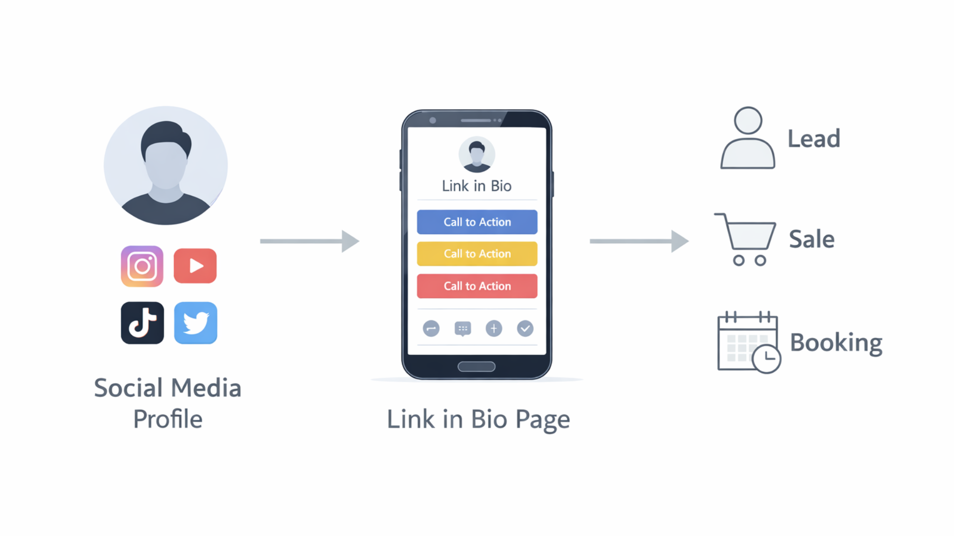
Are you struggling to figure out the link in bio problem if you use Instagram, TikTok, YouTube, or X? One link. Endless destinations. I’ve tested a lot of approaches over the years, and in my experience, a smart link in bio strategy turns casual clicks into real leads, sales, and bookings.
This guide covers 25 practical link in bio ideas, simple examples you can copy, and the best practices that actually work in 2026. I’ll point out common mistakes I see creators and small businesses make, share quick design tips for link in bio page design, and suggest tools that save time. If you want to convert social traffic into customers, this is for you.
Why your link in bio matters more than ever
Social platforms keep changing. Some let you add multiple links inside posts, others push short-form video. But the link in bio remains a single reliable gateway. Use it well, and you guide people off-platform into your funnel. Ignore it, and you waste attention.
Here’s the reality. People don't want to search for what you mentioned in a post. They click the link. If that click lands on a dead-end or a messy list of the latest content, you lose them. If it lands on a clear path, you win a subscriber, a sale, or a booking.
How to use this guide
Step 1: Thoroughly go through the 25 suggestions, understand them, and then pick three which you think will be most effective in helping you achieve the goals that you have set for yourself, e. g. , audience building, making a product sell, getting more consultation calls, or booking coaching sessions. Keep using those for a month, take a look at the clicks and conversions, and start changing.
Checklist before you start
- Know your goal for the link in bio: clicks, leads, sales, or bookings.
- Use clear CTAs in your posts: "link in bio to download," "link in bio to book."
Make a straightforward link in bio page that is mobile, friendly and loads quickly.
Use UTM tags and short links to track the clicks so you can identify the most effective ones.
Change the link frequently to reflect your most recent campaign or content.
Top conversion tactics I use
Small changes matter. A button labeled "Get the free guide" converts better than "Resources". An image of the lead magnet next to the button helps people decide faster. I’ve seen a conversion lift of 20 to 40 percent from these tiny tweaks.
Also, remove friction. Fewer fields on a signup form equals more signups. If you can ask for just an email and deliver the content, do it.
25 link in bio ideas with examples and quick tips
Below are practical ideas. I give a short example and one quick tip for each. Keep examples human and simple so you can implement them today.
-
Single campaign landing page
Example: A page focused on your current launch with one big CTA: "Preorder now".
Tip: Use it for launches and time-box the offer. Mention the deadline in your bio and posts to create urgency.
-
Curated resource list
Example: A short list of your favorite tools, templates, and blog posts labeled "Start here".
Tip: Keep the list under five items so people don't get overwhelmed.
-
Lead magnet signup
Example: Free checklist or ebook: "Download the 10-step checklist for better reels".
Tip: Tease one big benefit in the post that links to the signup. Promise and deliver a clear win.
-
Work with me (booking page)
Example: Direct booking link for consultations or coaching. Calendar embedded and clear pricing.
Tip: Offer a short free discovery call so people can warm up before committing to paid work.
-
Shop your products
Example: A mini storefront with top sellers, like "Shop my presets" or "Shop merch".
Tip: Show product images and one-line benefits. Add a "Best seller" label to guide choices.
-
Latest content hub
Example: A rotating link that always points to your newest blog post or YouTube video.
Tip: Auto-update with a CMS or use a tool that can point to the latest content without manual edits.
-
Multi-link landing page
Example: Classic list of links with thumbnails: podcast, shop, signup, recent video.
Tip: Keep branding consistent and prioritize the top three links above the fold.
-
Lead quiz
Example: "Find your ideal content format" quiz. People get tailored tips, and you get an email.
Tip: Short quizzes convert best. Three to five questions are enough to feel personalized.
-
Free mini course
Example: A three-email series teaching one quick skill. Great for building trust fast.
Tip: Use daily delivery. Short, consistent content keeps people engaged.
-
Exclusive community invite
Example: Invite to a private Discord or Telegram group for early access and Q&A.
Tip: Highlight what members get that the public does not. People join for access and belonging.
-
Case studies and results
Example: Short case study page showing how a client grew 3x in three months.
Tip: Use numbers and a clear outcome. Social proof sells.
-
Free tools or templates
Example: Downloadable content calendar spreadsheet or caption templates.
Tip: Give people time, saving templates. Everyone loves tools that make doing something easier.
-
Discount or promo page
Example: Limited, time discount code and a single CTA to buy immediately.
Tip: Make the discount clearly visible in your profile and posts so folks know to tap/click.
-
Podcast landing page
Example: Highlights of the episode, links to guests, and a subscription CTA so followers won't miss an episode.
Tip: For very long episodes, add timestamps so listeners can skip to the best parts.
-
Press and media kit
Example: An easy media kit with a bio, audience stats, and contact info for brand partnerships.
Tip: Download it as a PDF and add a contact button for fast communication.
-
Event registration
Example: Sign up for a workshop or live webinar. Clearly state the dates and what people will learn.
Tip: To decrease no, shows, mail a reminder and also include a calendar invite right after the registration.
-
Affiliate or partner roundup
Example: Authentic reviews and affiliate links to the equipment or software that you really use.
Tip: Disclose affiliate relationships. Trust beats extra revenue when you're building an audience.
-
Highlight reels
Example: A playlist of your top-performing short videos or tutorials for new followers.
Tip: Curate by theme. New followers want a quick tour of your best stuff.
-
Donate or tip page
Example: Buttons for Ko-Fi, Patreon, or other monetization options for fans who want to support you directly.
Tip: Explain what donations fund is. People like knowing their money supports real work.
-
Interactive experiences
Example: A mini, tool, such as a headline generator or a poll, which results in people staying longer on your page.
Tip: Guide your interactions towards an email capture at the end of it so that you can nurture the users later.
-
Multiple audience funnels
Example: Have the visitors pick "I want to learn", "I want to hire", or "I want free resources". Each of the three options leads to completely different paths.
Tip: Use straightforward labels and icons to facilitate the users' choice.
-
Seasonal or timely content
Example: Holiday gift guides, back, to, school tips, or a summer specials page.
Tip: Revise, refresh, or take down these pages annually to keep them up to date and relevant.
-
User-generated content showcase
Example: A gallery of photos or testimonials from customers. Add "Shop this look" links.
Tip: Promote tagging and reshares. Social proof is powerful in gaining credibility and clicks.
-
Hybrid click-to-book + lead capture
Example: Book a call or get a free audit. If they choose the audit, present them with a short form first.
Tip: Limit the number of qualifying questions to two or three so that you only take meetings with serious prospects.
-
Link as a mini homepage
Example: A concise about us section, services, testimonials, and one main CTA that matches your goal.
Tip: Think of a webpage as a handshake. Make it firm, reliable, and friendly.
Simple design tips that actually improve conversions
Design is not decoration. It guides decisions. If your link in bio page looks like a pile of links, people bounce. If it’s organized and scannable, people act.
- Put the most important link first and make it a button. People expect a clear CTA.
- Use one or two fonts and a limited color palette. Too many styles become noise.
- Make buttons big enough for thumbs on mobile. Test on your phone before publishing.
- Keep pages lightweight. Slow pages lose clicks. Compress images and avoid heavy embeds.
- Use microcopy under buttons to clarify what people get, like "Instant download" or "5 minute sign up".
Tracking and analytics that tell you what works
Clicks alone don't tell the whole story. You need to track what happens after the click. I like using UTM tags and a simple funnel: click, action, conversion. It’s not fancy, but it’s effective.
Track these metrics at a minimum:
- Click-through rate from profile to your link in bio page
- Click-through rate from the link in bio page to the final goal (signup, purchase, booking)
- Conversion rate after the second click
- Revenue per click if you're selling
Small changes, like changing a CTA wording, can move the needle. A/B test headlines and button text when you can, but prioritize changes that get you the biggest wins first.
Common mistakes and how to avoid them
I see the same pitfalls over and over. Avoid these, and you'll save time and frustration.
- Too many links. People freeze when faced with too many choices.
- Wrong landing page. If a post is about a free guide, don't link to your shop. Match intent.
- Slow pages. Mobile users won't wait. Aim for under 3 seconds of load time.
- No tracking. If you can't measure it, you can't improve it.
- Hidden CTAs. Make the action obvious. Don't bury your offer behind menus.
Tools and platforms for link in bio pages
You don’t need to build a custom site to get great results. Plenty of tools let you create an effective link in a bio page quickly. Here are categories and examples I recommend.
- Multi-link pages: Linktree, Beacons, whoozit style tools. Use them for fast setups and social-friendly UIs.
- Landing page builders: Carrd, ConvertKit, Squarespace for more brand control and email integrations.
- Shop and commerce: Shopify Buy Button, Gumroad, Payhip for quick product sales from social.
- Booking and calendar: Calendly, Acuity, or your own calendar page for one-click scheduling.
- Short links and tracking: Bitly, Rebrandly for branded short links and basic analytics.
Whoozit also offers link in bio page design and optimization if you want a tailored page that aligns with your brand and conversion goals. If you prefer DIY, pick a tool that integrates with your email service and analytics so everything flows into your CRM.
A simple 30-day plan to improve your link in bio
Don't try to overhaul everything at once. Here’s an easy month-long sequence I’ve recommended to creators and small businesses.
- Week 1: Pick one goal and build a single-purpose landing page for it. Add a clear CTA and mobile-friendly design.
- Week 2: Add tracking and UTM parameters. Create three post templates that point to the CTA. Publish daily or thrice weekly and measure.
- Week 3: Test a second CTA or button color. Introduce a lead magnet or mini course if you don’t have one.
- Week 4: Review analytics. Double down on what worked and set a follow-up plan for next month.
Simple steps repeated beat complicated plans done half-heartedly.
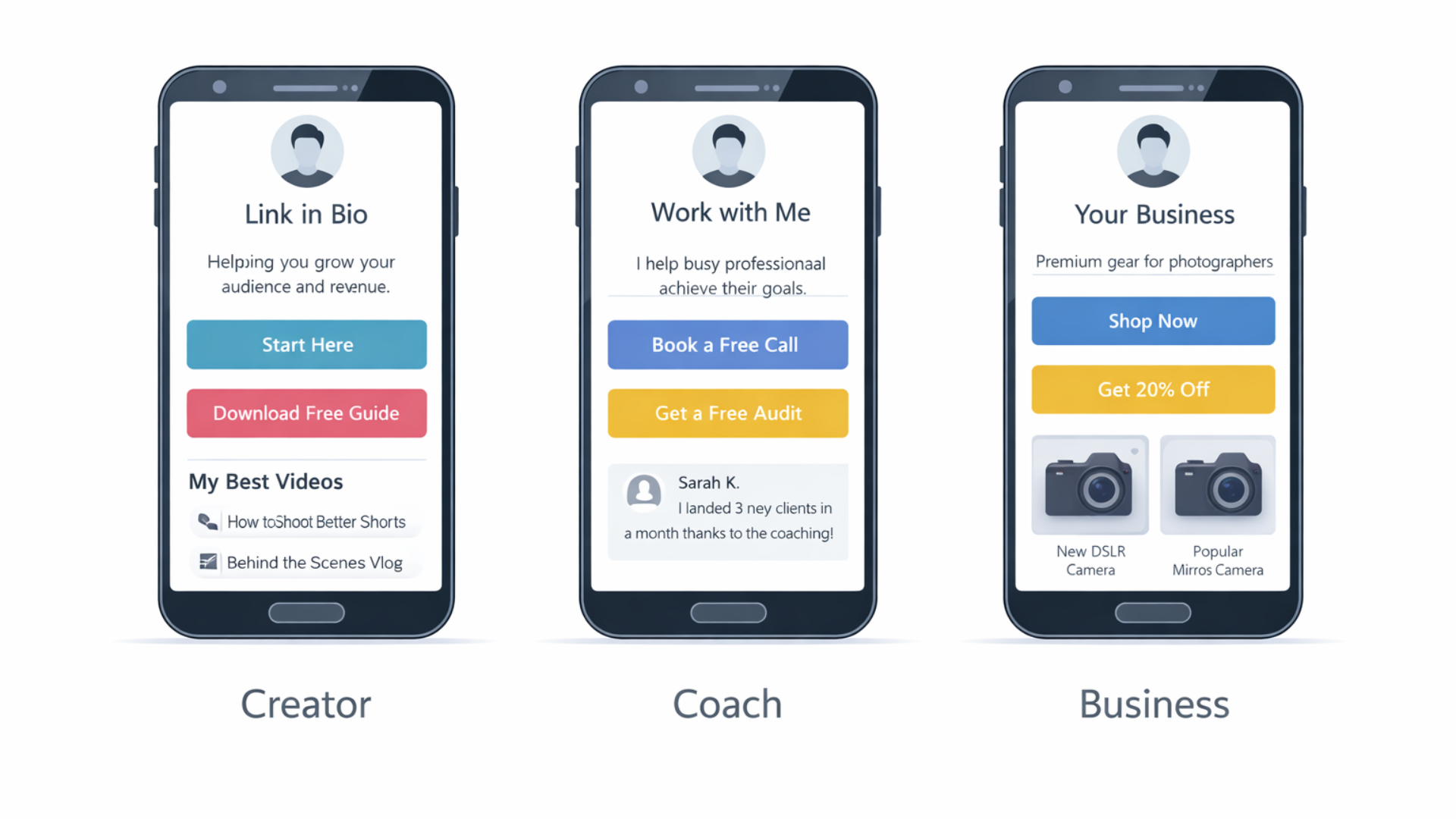
How creators and businesses use link in bio differently
Different goals need different link in bio strategies. Here’s how I recommend tailoring your page by role.
- Creators and influencers: Prioritize content and community. Offer a newsletter or Discord invite and a "best hits" playlist for new followers.
- Solopreneurs and coaches: Focus on bookings and lead magnets. A short survey or qualification form filters serious leads.
- Small businesses: Push product pages and seasonal offers. Use product images and a shop-first layout.
- Digital marketers: Track everything and run short tests. Use UTM links to compare channel performance.
Link in bio trends for 2026
We're seeing a few shifts that matter this year. First, people expect faster pages and clearer CTAs. Second, interactive content is catching on. Small quizzes and micro tools increase session time and conversions. Third, privacy and tracking changes mean you should plan to rely more on first-party data like emails and less on third-party cookies.
Longer term, I expect link in bio pages to act more like mini homepages, with multiple paths tailored to audience segments. If you can let visitors self-select — learn, buy, or book — you’ll reduce drop off.
Small examples you can set up in 10 minutes
Here are a few tiny setups that yield results fast. I often use these when testing a new idea.
- Free PDF signup: Put a short form and a download link on a one-page site. Promote with a single story and watch signups roll in.
- Book a 15-minute call: Link a scheduling page directly from your bio. Mention real available times in a post.
- Best hits playlist: Create a YouTube playlist of the 5 best videos and link it. New followers can binge your best content.
Examples of best link in bio examples
What does a good page look like? A clean one-column layout often wins. Below are three simple templates to model.
- Creator template: Profile photo, one-line value prop, big "Start Here" button to a lead magnet, followed by links to the latest video and shop.
- Coach template: Short headline about who you help and the result, a "Book a Free Call" button, client logos or testimonials, and an FAQ link.
- Business template: Hero product image, product benefits in bullets, prominent "Shop Now" button, and a small section for seasonal offers.
These aren't glamorous. They work because they reduce doubt, make the next steps obvious, and help visitors move forward in your funnel.
Common A/B tests to run
When you have enough traffic, run simple tests. Some of the fastest wins come from:
- Button text: Compare "Get the guide" with "Download checklist".
- Image vs no image: Test whether a product image increases clicks.
- Headline length: Short headline versus a one-line benefit statement.
- Form fields: Email only versus email plus name or phone number.
Test one thing at a time and run each test for at least two weeks or a few hundred clicks to get meaningful results.
Accessibility and inclusivity tips
Don't forget accessibility. Use a clear contrast between text and background. Make buttons large enough for touch. Add alt text for images and use descriptive link labels for screen readers.
Also consider language and cultural clarity. If your audience is global, avoid idioms that might confuse non-native speakers.
Read more:
Final thoughts
Link in bio is a small corner of your content ecosystem. Use it well, and it becomes a reliable conversion point. Don't overcomplicate things. Pick a clear goal, design a simple page that matches the post's intent, and measure results.
I've found that creators who treat the link in bio like a mini funnel see better lifetime value from their audience. A thoughtful page coupled with consistent posts and follow-up emails will outperform an unfocused list of links every time.
Frequently Asked Questions
1: What is the best link in bio strategy in 2026?
The best link in bio strategy in 2026 is goal-focused, not link-heavy. Instead of listing everything, send users to one clear action like a lead magnet, booking page, or product. High-performing pages act like mini funnels with clear CTAs, fast load times, and tracking enabled.
2: Should I use a single link or a multi-link page in my bio?
It depends on your goal. Use a single link landing page for launches, promotions, or bookings. Use a multi-link page only if you genuinely serve different audience needs. Too many links reduce conversions, so prioritize one primary action above the fold.
3: How do I track conversions from my link in bio?
Track conversions by using UTM parameters, short links, and analytics from your link in bio tool or website. Measure clicks from your profile, actions taken on the link in bio page, and final conversions like signups, purchases, or bookings. Clicks alone are not enough.
Helpful Links & Next Steps
Need help building a link in bio page that actually converts? Book a Meeting Today, and we can map a simple plan that fits your audience and goals.