Portfolio Design Ideas for Freelancers and Creators That Surprisingly Make You Stand Out
In the creator economy, your portfolio isn’t just a collection of projects; it’s your proof of work, your personal pitch, and your brand identity rolled into one.
But here’s the hard truth:
Most portfolios blend in. Overused templates, generic summaries, and uninspired layouts make even talented creators look forgettable.
If you’re a freelancer, student, or indie creator trying to make your mark, your portfolio design could be the difference between getting passed over and getting noticed.
This guide isn’t just a gallery of ideas.
It’s a strategy-first approach to portfolio design, built for people who want their work to stand out and actually lead to something whether that’s a job, a gig, or a new collaboration.
We’ll cover:
Design formats that capture attention quickly
Layout strategies that guide the viewer through your story
Ways to build trust even if you have limited experience
How to turn inspiration into a portfolio that reflects your unique style
No fluff. No generic advice.
Just real portfolio design ideas that you can use and recreate easily with tools lie Whoozit.
Why Portfolio Design Matters More Than You Think
Let’s be real: your portfolio gets judged before anyone reads a single word.
The layout, spacing, colors, and even the font choices silently tell a story about how you think, how you present yourself, and how much care you put into your work.
In short?
Your design is part of your brand.
1. Design Shapes Perception Instantly
When someone lands on your portfolio, their brain makes a snap call in under 3 seconds.
Does this person look professional?
Is this easy to navigate?
Is their work showcased clearly?
If the design feels rushed, outdated, or generic people will assume the same about your work.
2. A Good Layout Makes You Look More Experienced (Even If You’re Not)
Even if you’ve just started freelancing or creating content, a clean, intentional layout adds credibility.
It helps you show that you:
Understand clarity and presentation
Know how to focus attention on your strengths
Respect the time of the viewer
Design = silent confidence.
3. Your Portfolio Is Not a Gallery It’s a Guided Tour
A common mistake? Treating the portfolio like a dumping ground of past work.
But smart creators know better a strong layout tells a story:
What the project was
What your role was
What problem you solved
What you learned
And the design should guide the visitor from section to section like chapters in a book without friction or distraction.
4. People Remember Emotion, Not Just Projects
A beautifully designed portfolio isn’t just “pretty.”
It creates an emotional response, something that sticks:
“This person feels easy to work with.”
“Their work feels thoughtful.”
“I want to know more.”
That emotional edge can win you the opportunity especially in competitive spaces.
5. Tools Make Great Design Accessible
Worried you’re not a designer?
The good news is: you don’t have to be.
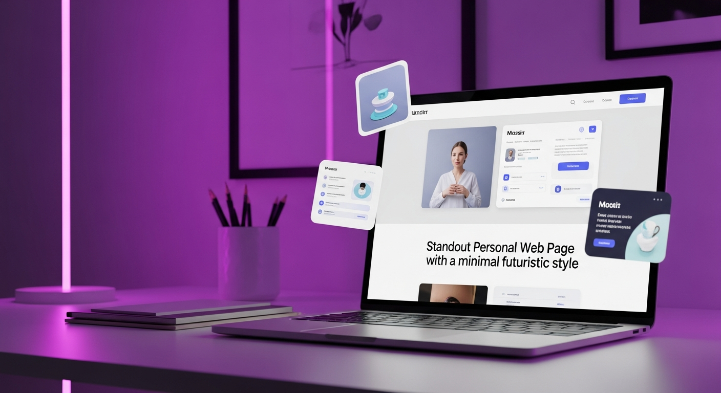
Modern portfolio tools like Whoozit offer layouts, visual blocks, and drag-and-drop features that help you:
Keep things consistent
Customize the flow
Add personality without breaking the grid
No design degree required. Just clarity, taste, and a few smart choices.
Final Thought:
If your portfolio looks like everyone else’s, it’ll feel like everyone else’s.
But when your design is thoughtful, intentional, and audience-aware your portfolio becomes unforgettable.
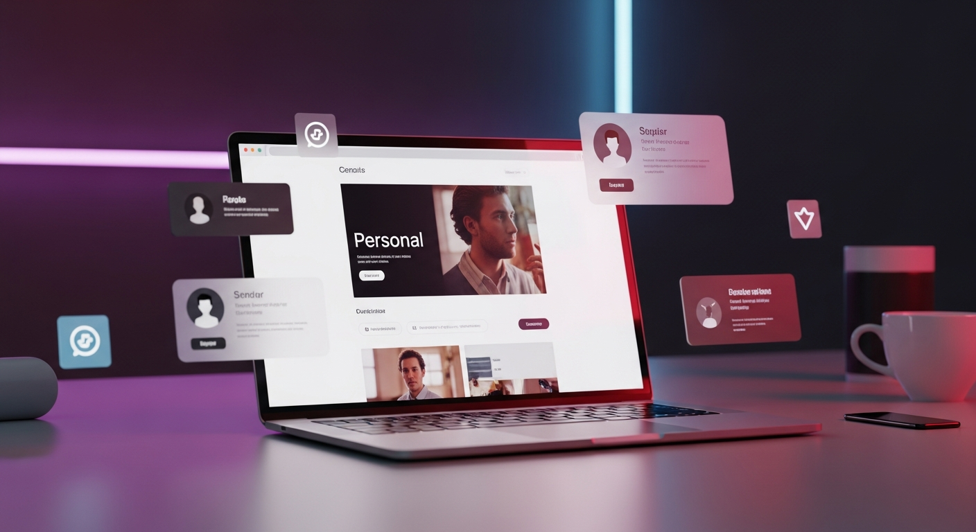
Portfolio Layouts That Actually Work (With Examples)
There’s no one-size-fits-all layout for portfolios and that’s a good thing.
The best portfolios aren’t just “clean” or “aesthetic.”
They’re purposeful. Each layout tells a different kind of story, highlights specific strengths, and guides viewers in a particular way.
Here are five high-performing layout types (with examples) and how to know which one’s right for you:
1. The Case Study Layout
Best for: Freelancers, UX/UI designers, developers, marketers
This format gives space to walk viewers through the process not just the end result.
Think of it like storytelling with structure:
The problem
Your process
The result
What you learned
Why it works: Shows critical thinking and professionalism. Perfect for clients or recruiters who want to see how you work, not just what you made.
2. The Visual Grid Portfolio
Best for: Creatives, designers, illustrators, photographers
This layout puts your visuals front and center. A simple, scrollable grid (with light captions) allows viewers to quickly scan your aesthetic.
Why it works: It’s fast, visual, and high-impact. People can get your vibe in seconds ideal for attention-deficit digital browsing.
Pro tip: Add hover effects or quick-click modals using tools like Whoozit’s Visual Blocks to make it more interactive.
3. The One-Pager Scroll
Best for: Content creators, indie makers, students building their first site
A single scrollable page with anchored sections:
About
Work Samples
Testimonials
Contact
Why it works: Simple, mobile-friendly, and easy to build. Great for creators who want to launch fast and iterate later.
4. The Interactive Portfolio
Best for: Developers, motion designers, digital artists, advanced creators
This layout uses animations, clickable prototypes, or embedded live projects (e.g., Figma embeds, GitHub repos, product demos).
Why it works: It’s immersive and unique. When done well, it keeps visitors engaged and proves your technical chops without needing a pitch.
Caution: Make sure it loads fast. Overloading on effects can hurt your UX.
5. The Narrative or Timeline Format
Best for: Writers, educators, researchers, creators with non-visual work
This format structures your work like a personal journey or timeline especially powerful when you’re showing growth or pivoting fields.
Why it works: Creates emotional connection and positions your portfolio as a story of progression, not just a skills dump.
Bonus Tip: Combine Layouts for Flexibility
Many creators mix formats e.g., case studies for client work, and a visual grid for passion projects.
With flexible platforms like Whoozit, you can build hybrid layouts using blocks, embeds, and custom sections without coding.
Portfolio Design Ideas That Make a Real Impression
Once you’ve chosen the right layout, it’s the design details that make or break the experience. These aren’t just aesthetic choices they shape how people feel about you, how much time they spend exploring your work, and whether they remember your name after they leave.
Here are 7 standout portfolio design ideas that actually work and can be recreated with simple tools like Whoozit.
1. Lead With a Personal Intro That’s Actually Memorable
Instead of a generic “Hi, I’m a designer,” write an intro that captures personality and clarity.
Try this:
“I design bold, scroll-stopping visuals for brands that don’t blend in.”
Pair it with a sharp portrait or expressive brand graphic. Set the tone early.
2. Use a Scroll-Stopping Cover Project
Open your portfolio with the project you’re most proud of not necessarily the most recent. Make it full-width, clean, and clickable.
Add a short headline:
“How I helped a small startup go viral in 72 hours.”
First impressions count and people don’t scroll forever.
3. Add a “Project Highlights” Section
Even if you have just 2–3 great pieces, isolate the best moments: before/after visuals, growth numbers, or one-sentence wins.
This makes you look results-focused even without a long history.
4. Integrate Testimonials as Visual Elements
Instead of burying client quotes at the bottom, bring them in as design features next to projects or between sections.
Example:
Overlay a quote on a screenshot of the finished work. Adds social proof and visual rhythm.
5. Use Bold Typography and Whitespace
Design is communication and sometimes less is more. Use strong, legible fonts, leave room for your work to breathe, and avoid clutter.
Pair 1 headline font with 1 body font. Keep your palette tight (2–3 colors max).
Make your words feel like they belong on a poster, not a slide deck.
6. Add a Micro “About Me” with Personality
People hire people, not portfolios. A small section with:
Your mission or vibe
What excites you
A fun detail (e.g., “I never miss F1 Sundays.”)
It builds emotional connection which often beats experience alone.
7. Finish With a Clean CTA That’s Not Just “Contact Me”
End with clarity. Instead of a generic button, try:
“Let’s collaborate here’s what I can help you with.”
“Want to build something bold? Let’s talk.”
Pair it with a calendar link, contact form, or even a Link-in-Bio built via Whoozit.
Pro Tip: Brand Your Portfolio Like a Product
Give it a consistent color palette
Add a favicon or personal logo
Use a custom domain or branded link
It shows you’re intentional and it tells people you care about the details (which clients love).
What to Include (Even If You’re Just Starting Out)
One of the biggest reasons people delay building a portfolio?
“I don’t have enough real projects yet.”
But here’s the truth: you don’t need a stacked client list to create a strong portfolio.
You just need to show how you think, how you work, and what you care about.
Here’s what to include even if you’re brand new:
1. Passion Projects or Personal Experiments
Did you redesign an app just for fun?
Mocked up a campaign for a brand you love?
Built a landing page for your cousin’s small business?
These count.
Personal projects are valuable because they show initiative and creativity — two things clients care about a lot.
Use tools like Whoozit to turn these into clean, scrollable case studies that look just as professional as paid gigs.
2. Before & After Screenshots
Don’t underestimate the power of simple visuals.
Whether it’s design, copywriting, branding, or even editing a “before and after” comparison gives instant clarity.
You can even annotate them with your thought process:
“Here’s what wasn’t working and how I improved it.”
3. Your Thought Process
In your project descriptions, go beyond “what you made.”
Explain:
Why you made certain choices
What you learned
What you’d do differently next time
This is where you stand out from people who just “upload and forget.”
4. A Visual Resume Section
Include a short, stylized overview of:
Your skills
Tools you use (Figma, Canva, Notion, etc.)
What services you offer
A fun detail that humanizes you
Platforms like Whoozit let you build a custom section just for this without touching code.
5. A CTA That Feels Natural
Instead of “Hire Me,” say something like:
“Want to collaborate on your next project?”
“Open to freelance gigs and creative collabs drop a message!”
Even if you don’t feel “ready,” showing openness creates opportunity.
Extra Tip: Use a “Coming Soon” Block
If you don’t have much yet, that’s okay.
Add a placeholder that says:
“More projects launching soon. Let’s connect in the meantime.”
It shows you’re building, not stuck.
Bonus Resource:
Want to see how early creators build trust with simple portfolio formats?
Browse Behance for minimal, beginner-friendly portfolios that showcase thought more than quantity.
Bottom line: You don’t need 10 big projects to start you just need one good one, presented well.
The rest? Comes with time, practice, and consistency.
Quick Fix: 3 Portfolio Mistakes to Avoid
Even great creators slip up. Watch out for these:
Generic Templates
→ Make your layout personal even small tweaks in colors and copy help you stand out.
Tools like Whoozit make customization easy.Too Much, Too Soon
→ Don’t overwhelm with 10+ projects. Curate your best 3–5 and explain why they matter.No Call-to-Action
→ Always end with a clear next step. “Let’s work together” beats “Thanks for visiting.”
Ready to Design a Portfolio That Actually Gets Noticed?
Whether you’re just starting out or ready to refresh your online presence, your portfolio deserves more than a template.
Whoozit helps freelancers, students, and creators build scroll-worthy, personalized portfolios no code, no fluff, no frustration.
Drag. Drop. Launch.
Make your ideas visible and your work unforgettable.
Start building with Whoozit now it’s free to try.
Conclusion: Your Portfolio Is Your Reputation Make It Count
In 2025, your portfolio is more than just a collection of projects it’s your digital first impression, your pitch, and your personal brand all in one.
And here’s the truth:
You don’t need to be a design expert or have years of experience to make a portfolio that stands out.
What you do need is:
A layout that fits your story
Design choices that build trust
A tool that makes it simple to launch and grow
Whether you’re a freelancer, student, or indie creator the right portfolio doesn’t just show your work.
It works for you